
The Man from the East and Camel


King Tut and The Sock Monkey
Have some favorite ornaments of your own? Share them with us on our blog or on our facebook page!


A big thanks to Ahn-Minh Le for my article in the SF Chronicle Home Section this past Sunday, Dec. 12! If you missed it, here’s a recap on how to make your own succulent arrangements at home!
Step 1: Gather your succulent arrangement components and group them on your workspace for a smooth assembly. I’m using succulents, eucalyptus, pyracantha or holly berries, crabapples, rose hips, and red and white roses and greens.

Step 2: Make your vase. I’ve recycled an aluminum can and used it for my vase. Glue or tape a strip of brown paper around the can and then wrap red ribbon around it, securing it once again with either glue or double-faced tape. Tie it together with a string of raffia for an authentic-handmade look.
 Step 3: Assemble the succulent arrangements making sure that the succulents dominate the bouquet. The berries, crabapples, and roses should accent the colors of the succulents, but not draw away from them.


 I love succulents because of their wide variety of shapes, textures and colors. Succulents are great year round plants to have in the garden. You can pick them and they last for weeks. Cottage Gardens in Petaluma, CA, where I recently hosted a succulent demonstration, has a wide variety of succulents. For more info about visit them at www.cottagegardensofpet.com
In this arrangement there’s a beautiful combination of acid greens and purples playing off each other. Their varying shapes make the arrangement more interesting. Notice the big blooms alongside the smaller feathery ones.
For more contrast, add some succulents with red tones giving it almost a holiday feel. The varying shapes and textures give the arrangement a unique look.
Adding other flowers to the succulents create a unique, one-of-a-kind look and feel for your succulent bouquet. I like the way this arrangement has combined white flowers and other greens.
For the holidays I’ve put together my own arrangements using various colors and shapes of succulents. This year I’m using succulents, red and white roses, pyracantha berries, crabapples, rose hips, and eucalyptus leaves. The green from the succulents give a lush and vibrant look to the arrangements, while the red and white tones from roses, berries, and crabapples contribute lovely holiday accents.
Be sure to check out my upcoming article by Ahn-Minh Le on holiday succulents in the San Francisco Chronicle this Sunday, December 12th. It discusses succulents and how to design your own arrangements with a personalized look and feel.
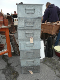
 Found these adorable Park City, Utah boys, Dustin Rowser and Chris Brady from uberchichome@gmail.com. They travel through France and pick up all kinds of wonderful linen textiles and galvanized finds.

 I like these patchwork and stenciled pillows from another booth.


 Move-in is tomorrow. Here is an "inside the process" photo of the before - 20 boxes to be picked up by Good Moves in a few minutes. How will I fit 20 boxes in my room? YIKES! I always take more than I need and I have a wonderful wrought iron bookcase which I have to fill with books and accessories. It has reclaimed wood selves from Restoration Timber in San Francisco http://www.restorationtimber.com/ More photos of the move-in tomorrow.
I find Fortuny irresistible. I will add Fortuny pillows. Mario Fortuny (1871–1949) born into an artistic Spanish family was a Renaissance man. He eventually settled in Venice, Italy via Paris and became a noted fashion designer (Fortuny Pleats), product designer and fabric designer.
Add Texture
I'm using a new sisal ("Paraiba" in color "River") from Merida Meridain as a bound area rug. The color is a very light taupe/gray. Their sisal is sustainable and there service is great. Check out their website for more detailed information. http://www.meridameridian.com/sustainability/

Add a Crackled Linen Ceiling
I'm really excited about my "Crackled Linen" ceiling from artist Jennifer LaPierre of Sonoma, jennifer@jenniferlapierre.com

I love the natural color, the way it hangs and the fact that it wrinkles. It has soul. I decided I would start with natural linen for the canopy and see where that led me. Henry Calvin Fabric has lovely linen and I found a natural linen for the outside of the canopy and a polished ivory linen for the lining and inside of the canopy. The day bed, placed between the dormer windows, is upholstered in a natural herringbone linen. The great thing about linens and neutrals is that they all work together. A weathered “dirt-colored” (dirt - one of my favorite colors) linen will be used for an accent pillow.
Add Velvet
Combining humble linen and luxurious velvet is delicious. I like the juxtaposition of the humble linen next to the luxurious velvet. I located a velvet for pillows that is the same color as the darker color in the herringbone linen, but it is a different texture and reflects light differently. It is a no-color color. 
Add an Accent Color
This was a process. I found three color stories that spoke to me;
I contemplated for two weeks but finally decided on sienna orange as the accent partly because I found a Fortuny fabric that I loved and a sienna Sandra Jordan alpaca throw that would color-wise.
How I like to use color
I like to use color sparingly and strategically. Here I have chosen a palette of neutrals with black and natural wood accents. I then identify the color accent(s) sienna, and use it in three or four places in the room, pillows, a throw, flowers, and accessories. The accent colors don’t have to match exactly; in fact it makes it more interesting if they don’t match exactly. I may gather orange flower that are brighter that the other accent oranges just for pop. I may identify another color to use in conjunction with the orange but I don’t have that decided yet.


 My room this year, entitled “Ivory Tower”, is a charming third floor dormer-windowed space in an historic Albert Farr (architect) Pacific Heights Mansion. Here is the sketch of my room.
 San Francisco University High School Decorator Showcase (located at 3450 Washington Street), was born in Omaha, Nebraska in 1871 and was raised in Japan where his father worked to establish the postal system. He came to SF in 1890 at the age of 18.
 time Modernism began to emerge. Farr’s most famous project is Wolf house, built for Jack and Charmian London in Glen Ellen in Sonoma County. Begun in 1910, the 15,000 square foot house, two years into construction, tragically burned down in 1912, most likely due to the spontaneous combustion of linseed rags left in the house. Under-insured, London could not afford to rebuild. The ruins can be visited at the Jack London Historic State Park.
 Albert Farr had a unique approach to his own view of this rustic Bay movement. Many examples of his works can be seen in
  Belvedere, Piedmont, Claremont, and Oakland, as well as San Francisco. His details include numerous gables, overhanging medieval half-timbered shingle designs with influences from Coxhead and Polk. This became a popular look that continued for many years. In fact, based on an erroneous building permit entry, the Showcase house was incorrectly attributed to Polk.
 e House
 he did this at 3450 Washington. Knowing this, I see what drew me to the room I’ll be designing for the Showcase – The room is small but the dormer window create a compelling charm; a space that might have been forgotton but was creatively captured. A small door between the windows leads to a secret hiding place.
 Mixing Styles and Influence
 preceding the popularity of Spanish Colonial revival in the 1920’s. Mission motifs can be seen in some of his earliest works. His interpretation is subtle, inventive and unexpected.
 Farr’s importance has gone relatively unnoticed by historians. Knowledgeable clients have always been aware of his talents. Farr retired at the beginning of WWII and his work was upstaged by the onset of Modernism. Albert Farr passed away July 12, 1947 in Piedmont after a distinctive 50-year career.
